
Leading the Site Refresher
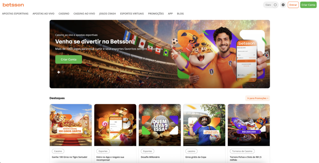
As part of improving the overall product experience, I led a site refresher focused on making the platform feel cleaner, more modern, and easier to navigate. The goal was not to redesign everything from scratch, but to refine the existing experience in a way that made the interface feel more polished, consistent, and focused on the actions that matter most.
One of the biggest visual changes was removing the orange header and moving towards an all-white header treatment. The previous orange header created a strong brand presence, but it also added visual weight to the top of the page and competed with key actions. By simplifying the header and using white as the primary background, we created a lighter and more modern experience that allowed the content and primary actions to stand out more clearly.
This change also helped place more emphasis on the “Create Account” button. By reducing the amount of competing colour in the header, the registration CTA became more visible and easier to identify. This was especially important because account creation is one of the most important entry points for new players.
Alongside the header update, I refreshed the overall visual language by making UI elements more rounded and approachable. Buttons, cards, containers, and other interface components were softened to create a more friendly and contemporary feel. This helped the site move away from a heavier, more rigid look and towards an experience that felt more refined and in line with modern product expectations.
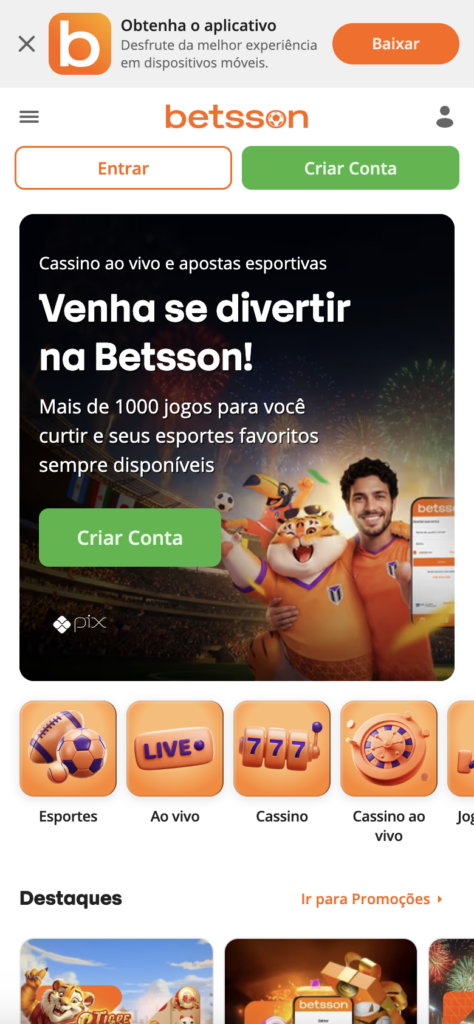
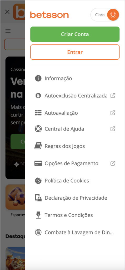
I also introduced a new set of 3D icons to add more depth and personality to the interface. These icons helped bring more character into the product while still supporting usability and clarity. The aim was to make key areas feel more engaging without overwhelming the experience or distracting from the main user journey.
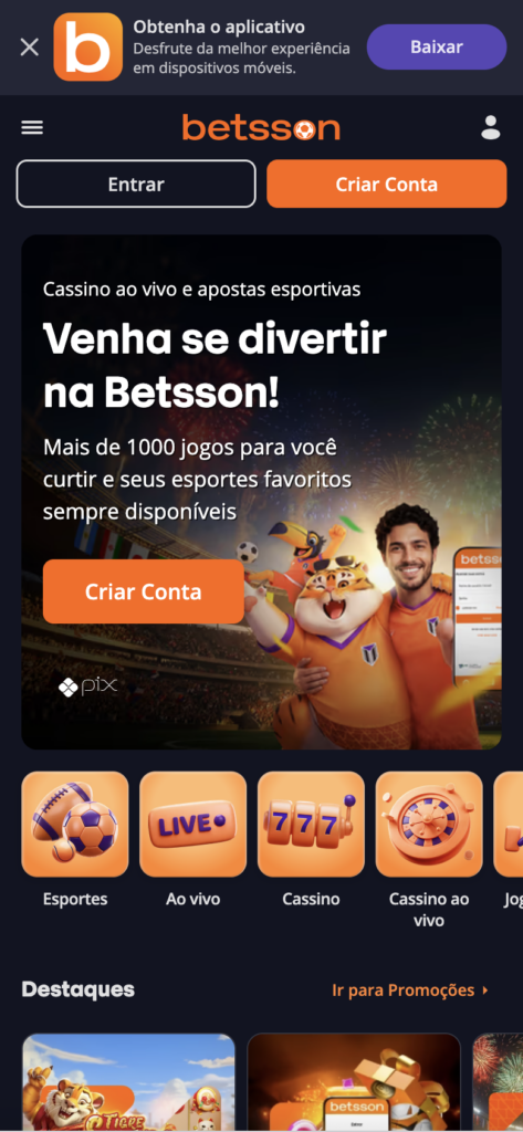
During the refresher, I also took the opportunity to introduce light and dark mode. This was a feature that players had requested in the past, and the visual refresh created the right foundation to bring it into the product. Light mode supported the cleaner and more modern direction, while dark mode gave players more control over their experience, especially in different lighting conditions or during longer sessions.
My role involved leading the design direction, aligning the visual updates with product goals, and making sure the changes improved both the look and usability of the site. I worked on creating a more cohesive interface that balanced brand expression, clarity, and player needs.
The result was a refreshed experience that felt cleaner, more modern, and more focused. By simplifying the header, improving the visual hierarchy, modernising the UI elements, introducing 3D icons, and adding light and dark mode, the site became more flexible, polished, and aligned with what players expect from a modern digital product.